
It is the topic foremost on everyone’s minds. COVID-19. We are now in our ninth month of the pandemic and according to the media, confirmed cases, hospitalizations and deaths are once again surging. It’s exhausting to try to keep up.
But entrepreneurs are experts in analyzing and assessing data. With the holidays rapidly approaching we need to stay vigilant with our COVID-19 prevention protocols and use our analytical skills to make both personal and business decisions. COVID-related closures and community lockdowns can impact hiring, inventory, and more.
Meanwhile, on the personal front, we’re deep into the holiday season. The CDC recommends not traveling unless absolutely necessary. The best way to prevent the spread of COVID-19 is to stay home and not come in contact with groups of people. If you absolutely must gather, wear a mask, and make sure you stay 6 feet apart. In addition to these important guidelines, it’s also good to stay informed so we’ve compiled a list of the ten most popular COVID-19 maps, dashboards, and data visualizations.
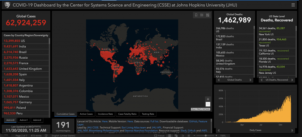
1. Johns Hopkins University is one of the best known COVID dashboards. JHU has been tracking COVID since January 2020 and offers one of the most comprehensive views of the data.
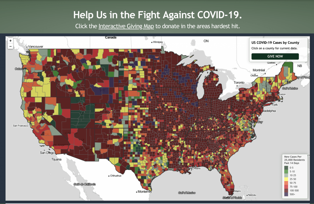
2. The Giving Map: The Giving Map tracks confirmed cases and deaths and displays county-by-county the number of cases per 25,000 inhabitants. The visualization helps you see at a glance whether your county is a hotspot or not. The Giving Map also allows visitors to click through to Charity Navigator and make donations to local charities in the hardest-hit counties.
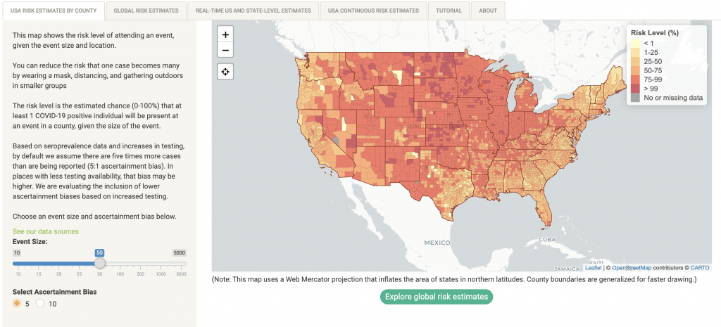
3. The Georgia Tech Map allows you to make a risk assessment based on location and number of attendees based on the gathering.
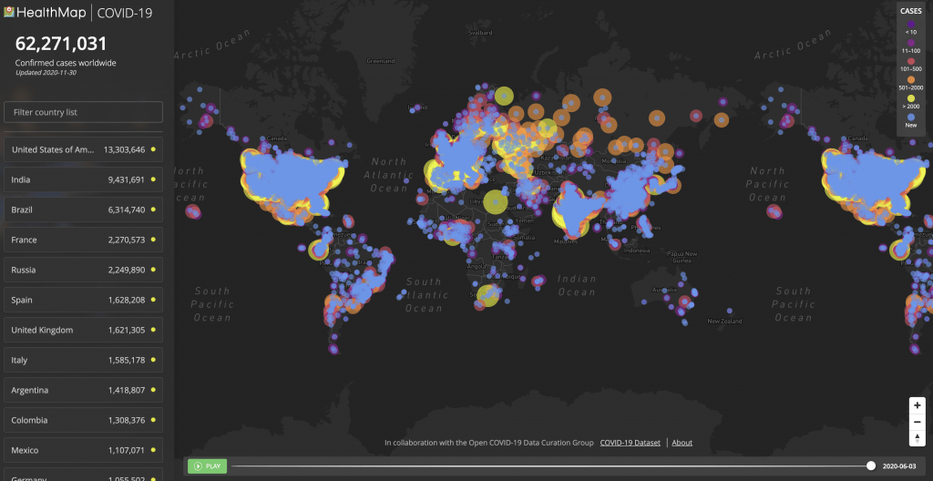
4. Healthmap.org offers a country-by-country count and you can “play” the map to see the growth in cases from January to June in any of the locations.
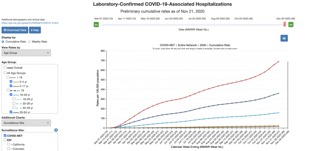
5. COVID-NET is a weekly summary of hospitalizations and shows the cumulative hospitalization rates for kids and adults. It’s a project of the U.S. Department of Health and Human Services.
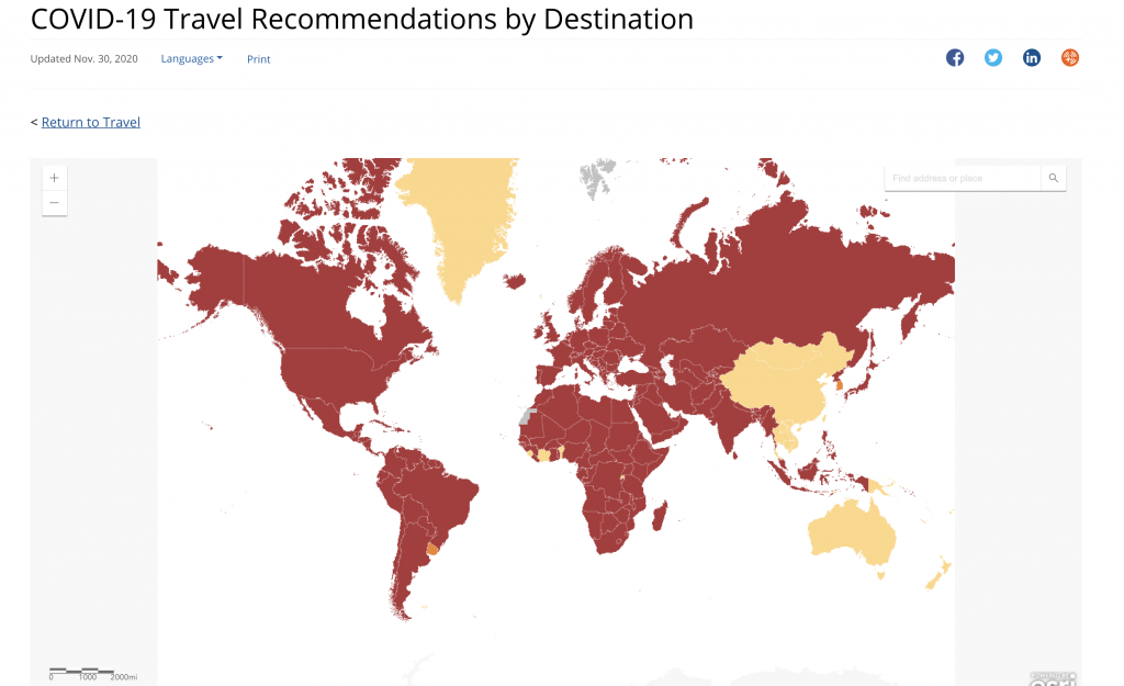
6. CDC Travel Map focuses on travel recommendations by country.
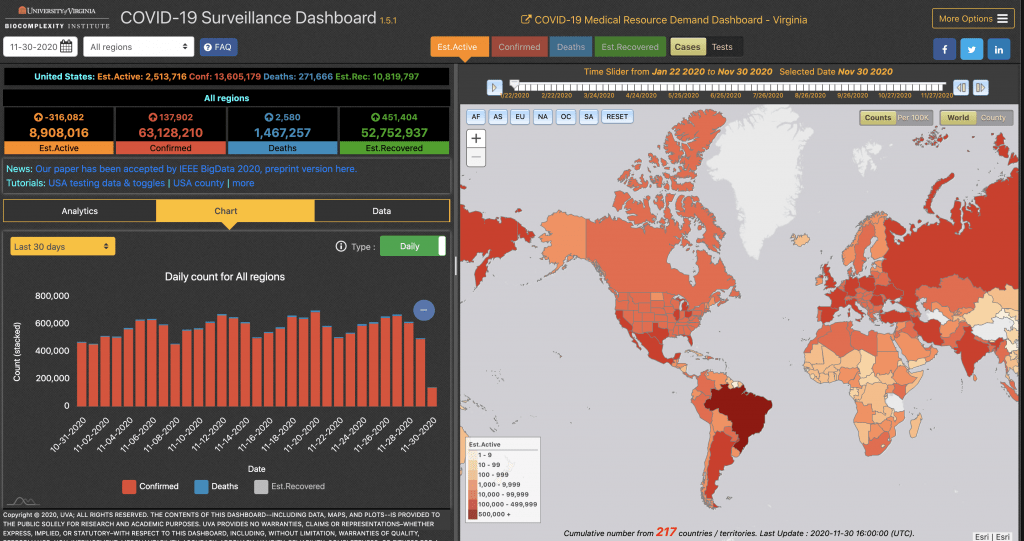
7. University of Virginia’s dashboard focuses on demand for medical resources.
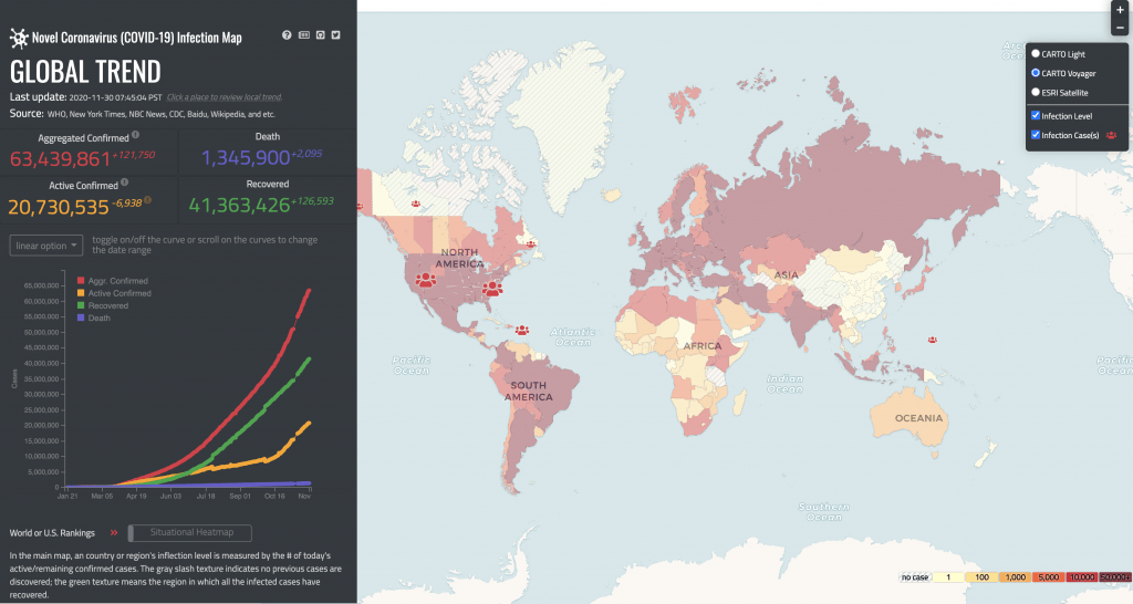
8. University of Washington looks at global trends around confirmed cases, deaths and recoveries.
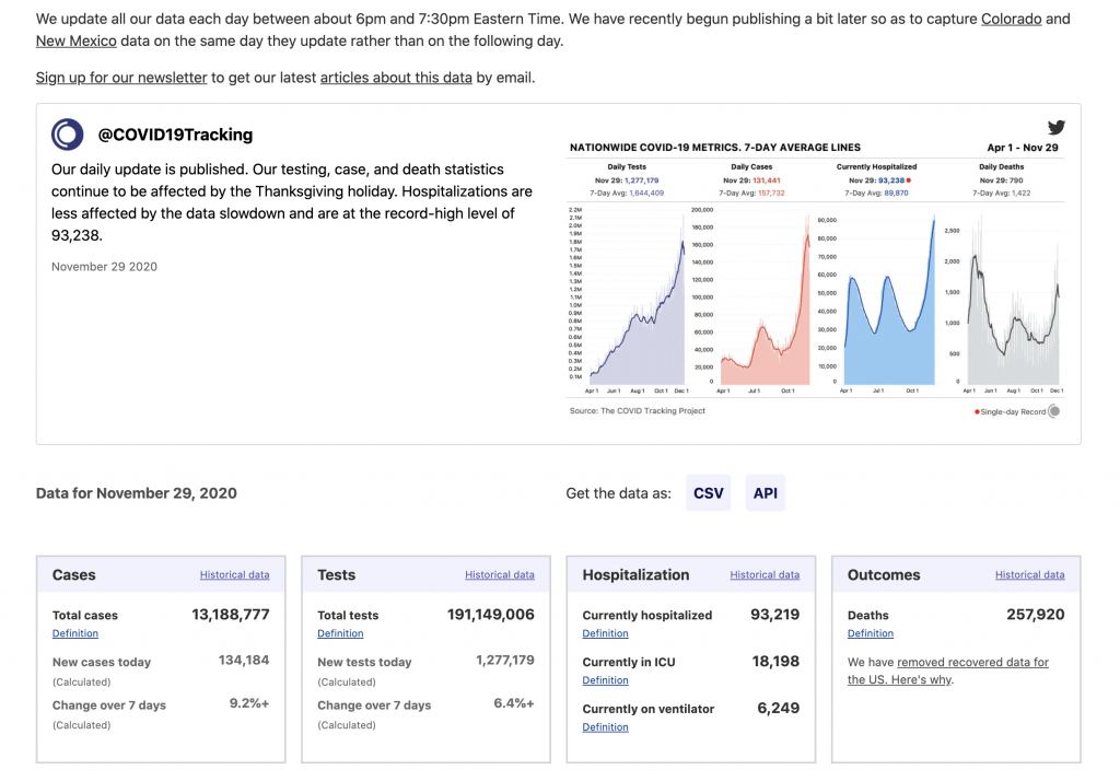
9. COVID-Tracking is a volunteer-powered organization launched by the Atlantic. This group provides data collection and visualization to a number of different organizations and the media. The website also includes information on how COVID rates have impacted different communities, including racial and ethnic data.
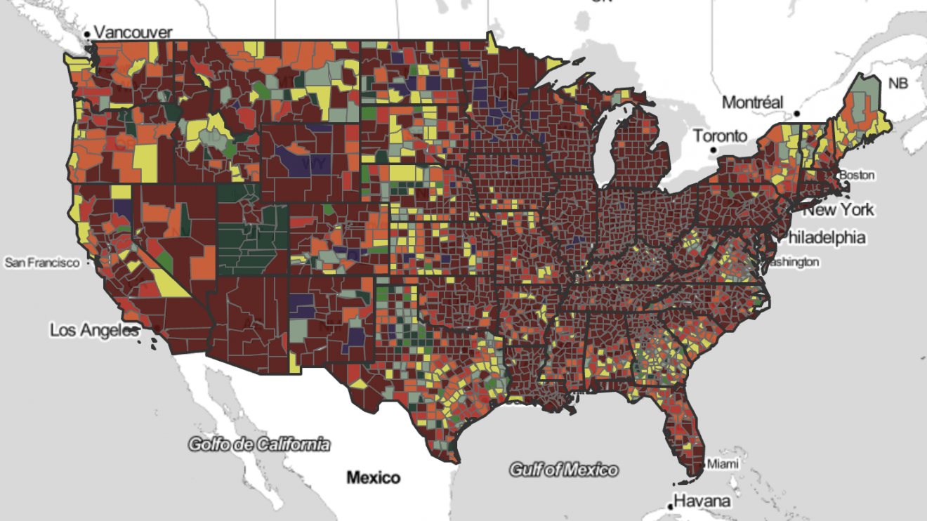
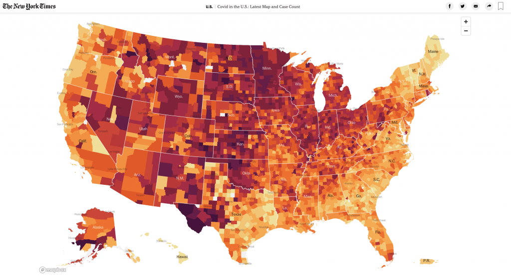
10. The New York Times offers a number of different maps tracking COVID cases. In addition to this “hot spots” map of the USA, the Times also offers a world view and dashboard tracking cases at colleges across the US.


Add Comment